Things to do in Oakville
Designer, Front-end Developer, Back-end Developer
Discover, connect, belong: Oakville’s vibrant events and activities brought to your fingertips, fostering community spirit and belonging preview image of project
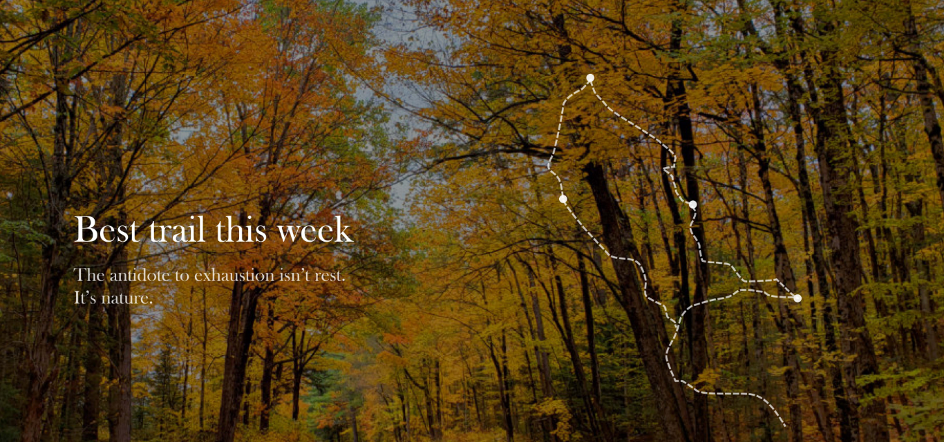
Goal
Our project goal is to design and develop a centralized website for Oakville residents and tourists, providing comprehensive access to local events, exhibits, activities, parks, and trails, thereby streamlining information currently scattered across the internet.
By offering a user-friendly platform, we aim to facilitate greater community engagement among residents and enhance municipal tourism efforts.
Process
Intial Concept
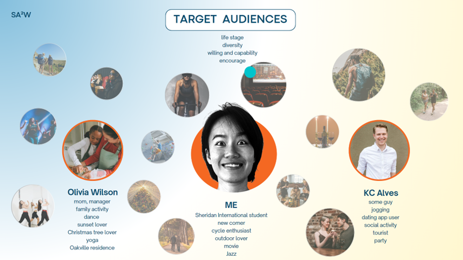
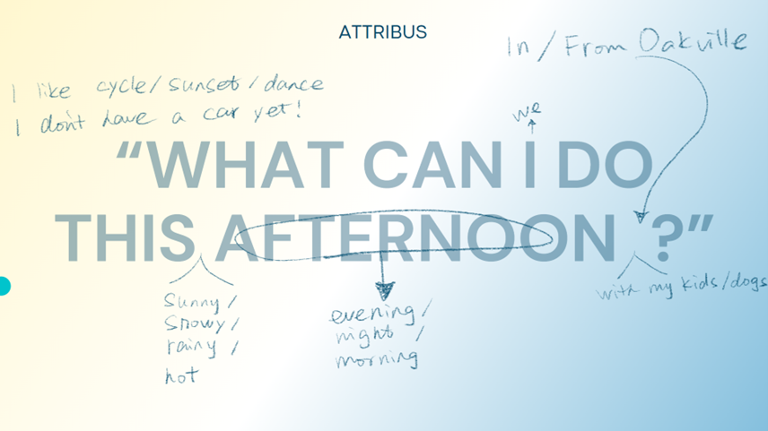
Our target audience encompasses tourists, new residents, students, and outdoor enthusiasts in Oakville, including those with limited transportation seeking comprehensive online information, embracing diversity, various life stages, and fostering willingness and capability to engage with our platform, ultimately encouraging community participation and exploration. With our broad demographic in mind, we designed an app where people can find what the want to do
Basic Layout

Our design choices were guided by research on content quality, platform security, and user engagement. We're improving navigation and ensuring accurate information by dividing our website into two main categories: activities and events.
- Events are planned gatherings, fostering social interaction.
- Activities offer ongoing leisure options.
Organizing activities by type and season simplifies choices, especially for outdoor pursuits affected by different weather conditions, helping users make informed decisions and feel more connected to Oakville.
Wireframes
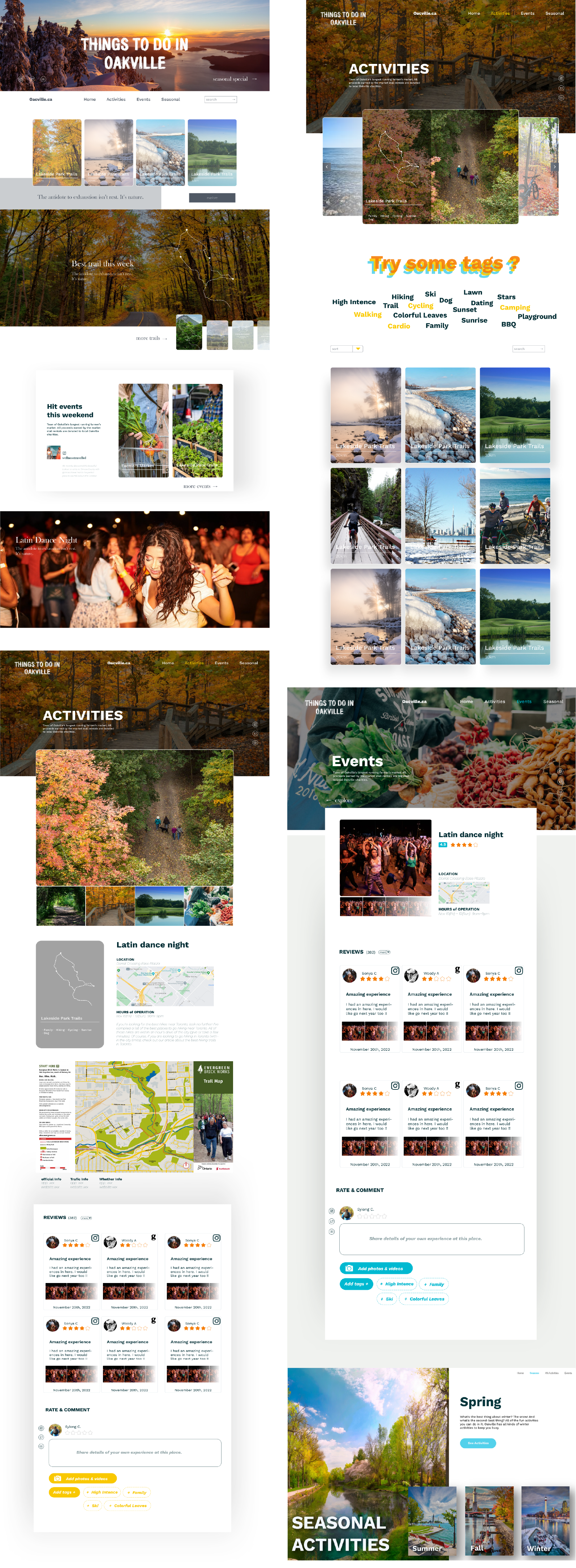
We mainly wanted to show off the trails and activities in Oakville, so we based our design around pictures. These images capture the essence of Oakville.
On the activity pages, you can find information about trails, with a focus on the images. You'll see where the trail is on a map, what it looks like, and read reviews from others who have been there.
The events page works similarly to the activity page.
We also have seasonal pages that highlight activities suitable for each season. You can filter these activities by the season you're interested in.
Development

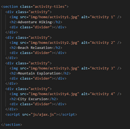
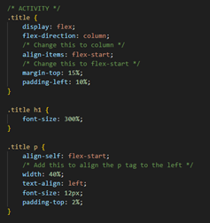
We used HTML, CSS, and JavaScript to create basic interaction on our website. To cycle through images without refreshing the whole page, we used AJAX.
For managing our database, we used PHP and PhpMyAdmin. This allowed our administrators to directly add or remove articles from the database without needing to interact with the website interface.
Outcome
Our initial prototype focused on showcasing basic interaction and appearance while testing navigation and usability. We created prototypes for the homepage, activity pages, and event pages.
Elements such as seasonal pages, reviews, and map integrations are planned for possible future iterations but were not included in the initial prototype.
Challenges
As a team, we all contributed to designing and developing the website. Being students with various commitments, we had to work asynchronously. Our biggest challenge was coordinating our schedules to create a timeline that worked for everyone, designing separate components that still had a cohesive look and structure, and coding separately while ensuring seamless integration.
Since everyone's priorities differed, project planning became crucial, and it was important for all members to be aligned. We tackled this challenge by establishing a design scheme, agreeing on a file naming convention, organizing documents, and leveraging each other's strengths and weaknesses.
This all-hands-on-deck approach taught me valuable skills in team management and filling technical gaps to successfully complete a project.